


背景色
background-色-RGBAの配色
tailwindcss
        .bg-pink-500

css
        -tw-bg-opacity: 1;
        background-color: rgba(236, 72, 153, var(--tw-bg-opacity));
Flexbox
display
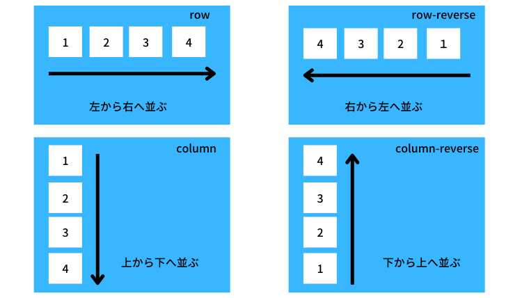
flex-direction
子要素をどの方向に配置していくかをflex-directionで指定します。
横または縦に並べられます。
| 値 | 説明 |
|---|---|
| row(初期値) | 子要素を左から右に配置 |
| row-reverse | 子要素を右から左に配置 |
| column | 子要素を上から下に配置 |
| column-reverse | 子要素を下から上に配置 |
<div class="container">
    <div class="item">Item 1</div>
    <div class="item">Item 2</div>
    <div class="item">Item 3</div>
    <div class="item">Item 4</div>
</div>
.container{
display:flex;
flex-direction:row-reverse;
}
.item{
background:#0bd;
color:#fff;
margin:10px;
padding:10px;
}
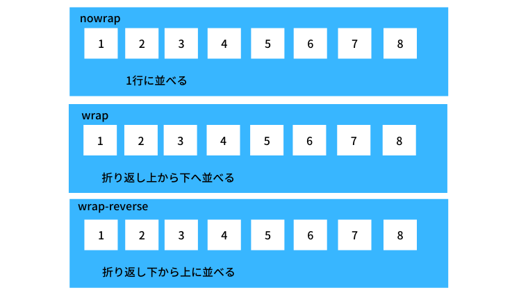
flex-wrap
子要素を1行、または複数行に並べるかをflex-wrapプロパティで指定します。複数行にする場合は子要素が親要素の幅を超えてしまった場合、折り返して複数行に配置されていきます。
| 値 | 説明 |
|---|---|
| nowrap(初期値) | 子要素を折り返しせず、1行に並べる |
| wrap | 子要素を折り返し、複数行に上から下へ並べる |
| wrap-reverse | 子要素を折り返し、複数行に下から上へ並べる |
            <div class="container">
                <div class="item">Item 1</div>
                <div class="item">Item 2</div>
                <div class="item">Item 3</div>
                <div class="item">Item 4</div>
                <div class="item">Item 5</div>
                <div class="item">Item 6</div>
                <div class="item">Item 7</div>
                <div class="item">Item 8</div>
            </div>
.container{
display:flex;
flex-wrap:wrap;
}
.item{
background:#0bd;
color:#fff;
margin:10px;
padding:10px;
}
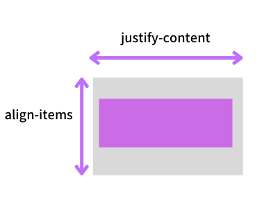
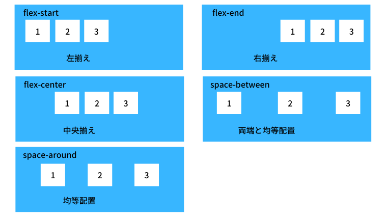
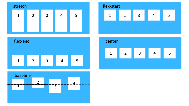
justify-content
親要素に空きスペースがあった場合、子要素を水平方向のどの位置に配置するかをjustify-contentプロパティで指定します。
| 値 | 説明 |
|---|---|
| flex-start(初期値) | 行の開始位置から配置。左揃え。 |
| flex-end | 行末から配置。右揃え。 |
| center | 中央揃え |
| space-between | 最初と最後の子要素を両端に配置し、残りの要素は均等に間隔を空けて配置 |
| space-around | 両端の子要素も含め、均等に間隔を空けて配置 |
<div class="container">
    <div class="item">Item 1</div>
    <div class="item">Item 2</div>
    <div class="item">Item 3</div>
    <div class="item">Item 4</div>
</div>
.container{
display:flex;
justify:flex-end;
}
.item{
background:#0bd;
color:#fff;
margin:10px;
padding:10px
}
align-items
親要素に空きスペースがあった場合、子要素を垂直方向のどの位置に配置するかをalign-itemsプロパティで指定します。
| 値 | 説明 |
|---|---|
| stretch(初期値) | 親要素の高さ、またはコンテンツの一番多い子要素の高さに合わせて広げて配置 |
| flex-start | 親要素の開始位置から配置。上揃え |
| flex-end | 親要素の終点から配置。下揃え |
| center | 中央揃え |
| baseline | ベースラインで揃える |
<div class="container">
    <div class="item">Item 1</div>
    <div class="item">Item 2</div>
    <div class="item">Item 3</div>
    <div class="item">Item 4</div>
</div>
.container{
display:flex;
align-items:center;
height:100vh;
}
.item{
background:#0bd;
color:#fff;
margin:10px;
padding:10px
}
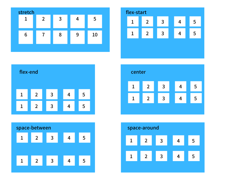
align-content
子要素が複数行にわたった場合の垂直方向の揃えをalign-contentプロパティで指定します。
「flex-wrap:nowrap;」が適用されていると子要素が1行になるのでalign-contentプロパティは無効になります。
| 値 | 説明 |
|---|---|
| stretch(初期値) | 親要素の高さに合わせて広げて配置 |
| flex-start | 親要素の開始位置から配置。上揃え |
| flex-end | 親要素の終点から配置。下揃え |
| center | 中央揃え |
| space-between | 最初と最後の子要素を上下の端に配置し、残りの要素は均等に間隔を空けて配置 |
| space-around | 上下端にある子要素も含め均等に間隔を空けて配置 |
<div class="container">
    <div class="item">Item 1</div>
    <div class="item">Item 2</div>
    <div class="item">Item 3</div>
    <div class="item">Item 4</div>
    <div class="item">Item 5</div>
    <div class="item">Item 6</div>
    <div class="item">Item 7</div>
    <div class="item">Item 8</div>
</div>
.container{
display:flex;
flex-wrap:wrap;
align-content:space-between;
height:300px;
}
.item{
background:#0bd;
color:#fff;
margin:10px;
padding:10px
}
flex
flex は、flex-grow, flex-shrink, flex-basisの3つの値をまとめて指定するプロパティです。
| 指定する数値の数 | 単位あり/なし | プロパティの意味 | 例 |
| 1つ | 単位なし | flex-grow | flex: 1; |
| 1つ | 単位あり | flex-basis | flex: 10em; flex: 30%; |
| 2つ | 単位なし | flex-grow、flex-shrink | flex: 2 2; |
| 2つ | 単位あり (1つ目の値は整数値) | flex-grow、flex-basis | flex: 1 30px; |
| 3つ | (1つ目と2つ目の値は整数値) | flex-grow、flex-shrink、flex-basis | flex: 2 2 10%; |
Flex 1
「flex: 1;」は、「flex-grow: 1;」、「flex-shrink: 1;」、「flex-basis: 0;」の3つ同時に指定したことと同じ意味になります。
flex-shrinkのデフォルト値は1のため、そのまま「flex-shrink: 1;」になります。
flex-basisのデフォルト値はautoですが、省略時のデフォルト値は0のため、「flex-basis: 0;」扱いになります。
つまり、「flex: 1;」と指定した場合は「flex-grow: 1;」と同じ動作になります。
Auto
None
| class | Properties |
|---|---|
| flex-1 | flex: 1 1 0%; |
| flex-auto | flex: 1 1 auto; |
flex-grow
値が大きいほど、幅が広くなる。デフォルトは0。
全ての子要素に1を指定すると、均等に幅が広くなる。
CSS : grow
.parent  {
    display:   flex;
}

.children {
    flex-grow: 1;
}
実行結果
子1(.child-1)のflex-growを2に変更する。子1の増加分が多い。
CSS : grow
.parent  {
    display:   flex;
}

.children {
    flex-grow: 1;
}

.child-1 {
    flex-grow: 2;
}
実行結果
flex-shrink
flex-shrinkのデフォルト値は1
order
basis
flex-basisは、flexアイテムの基準となる幅を設定するプロパティです。
flex-basisのデフォルト値はautoですが、省略時のデフォルト値は0
